EP 45: American (Design) Carnage
This week, we dissect an emergency logo that doesn't even exist anymore, we consider word art in official government documents, and scroll to the end to see our brand new hat!
Four Hour Presidential Design Work Week
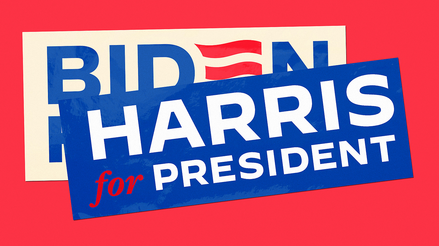
This week, we dissect in maybe-too-great-of-detail, the post-Biden dropout logo, which (in four hours) translated Biden’s visual style to the new Harris campaign. To make a long story short, Biden’s logo was built to subliminally communicate to Biden’s target audience—hence the use of a font called “Decimal” as his main typeface. Decimal, we learned is based on lettering for vintage watch faces—and like, what could BE more grandpa than that?
Anyway, the new logo (see above) created a kind of semiotic short circuit (and is just kinda visually boring—sorry) due to watch lettering not really connecting with whatever it is we have come to understand about Kamala Harris.
We looked too at her previous logo, as seen below (and which infamously and confusingly was styled for a while in the color scheme of Wretched of the Earth), and also the general heightened personality of all the 2020 logos.
Harris has been updating her logo somewhat in the last few weeks, but still it seems pretty boring—maybe speaking to a strategy of trying to seem inconspicuous and nondefinite in order to squeak by without notice. All in all, kind of depressing—like, wouldn’t it be exciting to have some kind of representation that stood for something and wasn’t afraid to say it?
Official Extrusions
Helen keyed us into the wacky world of word art in official government documents. Of particular interest is the constitution of the Brazilian state of Tocantins, in part because it just looks like an incredible place to be. Like, if your state was this beautiful, why wouldn’t your government documents match?
Not So Many Fish in the Stream
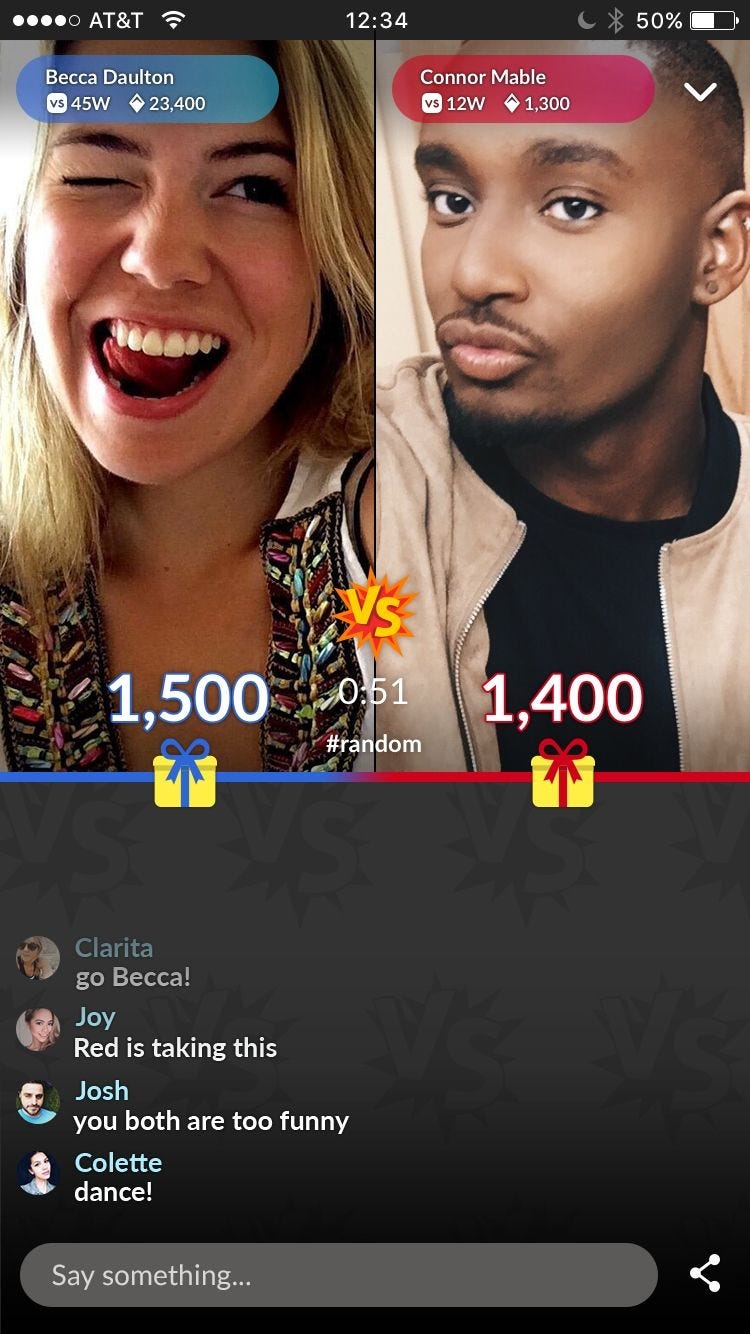
Random segue: we learned that Match.com has decided to cancel its streaming services on some of its dating apps. While simultaneously learning that they had offered streaming services. Seems pretty dystopian all around! (insert dread)
Rain, Hail, Sleet or… Drip?
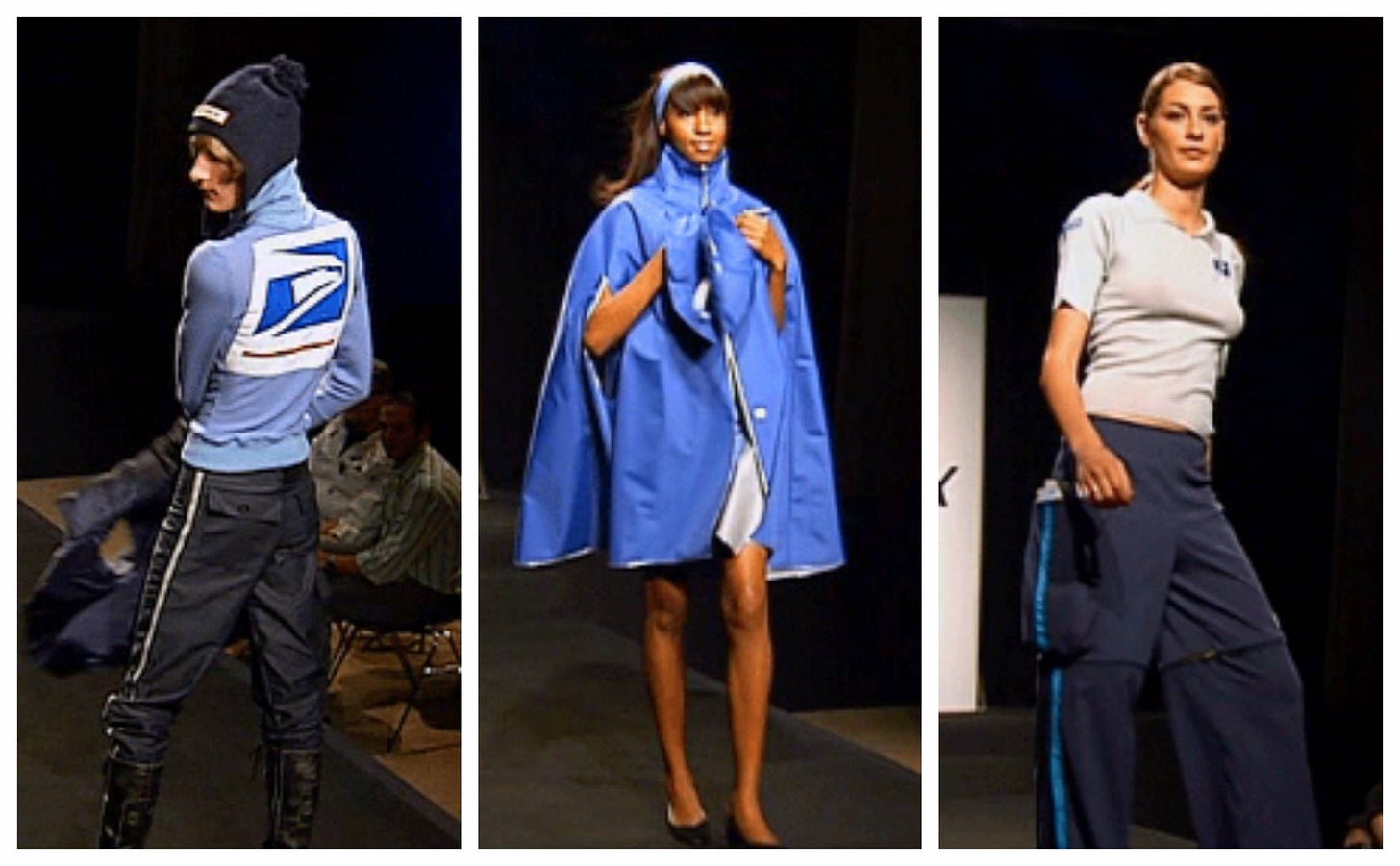
And finally, we consider the US Postal Service uniform, in all its wonder. This was supposed to be a palate cleanser after our conversation about the weirdness of online dating and general enshittification of the internet, but… things didn’t go quite as planned. We consider what the meaning of “the good life” is in relation to the priorities of the state! Like, if the postal service didn’t exist today and we tried to invent it, there would be no way the government would even get close to imagining something so radical (and stylish).
40 Trillion DPI Free Fonts Hat!
Speaking of apparel—we’ve just come hot off the heels of tabling at SF Art Book Fair which was in July. We’ve got a lil e-comm situation setup where you can get your hands on this COOL NEW HAT we made. It says FREE FONTS on it.
Also check out our second edition of Acquaintance Cards!! OK ciao!!


