Biblically Accurate Zazzle Designers in the Age of Streaming
Glyphs, Seraphim, Total Art, Blooming Elegant
This week, we are not exactly sure how we got into what we got into—it seems we’ve been working too much and at weird odd hours, and the topics we found ended up being a little bit bizarre because of it.
TOTAL PACKAGING
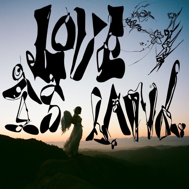
First up, we talked about a piece Helen found from The Art of Cover Art, called “Maximalist Text-Based Art, In the Age of Streaming?!”. The piece is all about a trend where artists are creating busy, borderline illegible album artwork, against the design conventions of streaming services. Like, you’d imagine if you were creating something that would need to communicate at different sizes (particularly at dime-size on a phone) you’d go for clean highly legible san serifs or something—or else run the risk of listeners not even understanding what it was they were seeing.
One thing that was interesting that the article pointed out was how many covers are eschewing titles and artist names altogether, since those pieces of information are already covered by the streaming services/context within which the images would be seen. Like, there is no way to find this music in the bargain bin at the thrift store and be puzzled by it! It will pretty much always live next to some text telling you what it is.
Unlike many fine visual artists, musicians create mass produced goods in need of packaging/presentation. Bands need to create these “total artworks” where not just the music, but the visual design, the clothing, the performance, all feed into a sort of complete presentation. Artists (as a sort of segment of the design world) are here in order to break rules, to make “bad” or “odd” or “difficult” design decisions. On one hand it is a sign of their particular genius—on the other, it is a sort of pose to indicate to listeners that they really don’t care whether you can read what they’re writing or not!
In this sense, they get to be in a kind of fun design space. Needing to communicate but also needing to sort of act like they’re not communicating. They can’t seem too thirsty. These are design spaces we look to to NOT be safe—to do ridiculous things with their work and art and time. That’s how we know that they’re free—and that’s part of the fun of investing our fandom or care in their work.
GLYPHS AND SERAPHIM
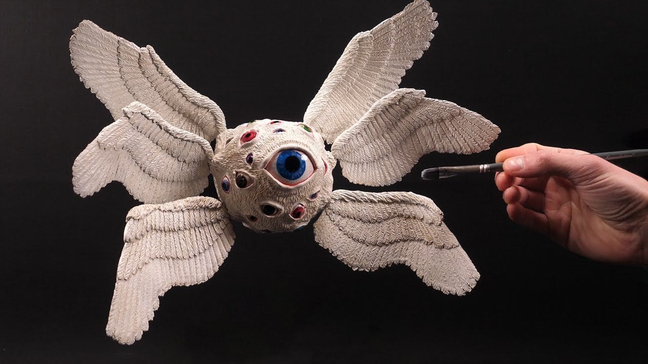
Another piece Helen somehow unearthed is the case of the Multiocular O, an ancient glyph, apparently only occurring in *one* historical manuscript that somehow has made its way into official Unicode. It’s a totally incredible character, based on biblically accurate descriptions of angels.
Which is nuts! Just the idea of some bored scribe in the 15th century being like, “I’m gonna illuminate the FUCK out of this manuscript!” and stacking 10 dotted O’s on top of one another—it’s kind of trippy to even imagine. And also really relatable. The impulse to make interlocking trippy, borderline threatening glyphs has been with us since the beginning of time!
“Honestly, the coolest Cyrillic glyph of O ever”—Helen
BLOOM AND BEZAZZLE
This piece of news Justin found probably by searching “graphic design” and “news” in google. There are always a couple articles like this floating around. Are they interesting? Sort of? Even before AI, they read as if they had been conceived by AI as “graphic design news.” It was a slow week! Anyway, the article details a battle between the print-anything-on-anything-on-demand company, Zazzle, and the designer of one of Zazzle’s most-used fonts, "Blooming Elegant.” Turns out Zazzle never even bothered to buy a license for the font, and now the designer is suing them, for some amount that could literally tank the whole company. It doesn’t seem like she has a great case though—since fonts can’t be copyrighted in the United States. What!
The interesting thing here was actually about the culture of Zazzle designers—people who will use Zazzle’s online design software (that is supposedly usable by anyone) to create your “self-designed” merch for you. They apparently love Blooming Elegant, and when it got removed from the site, they protested—writing songs, circulating petitions, generally just being bereft. It’s so interesting to think about the communities of designers out there who are really far outside of the world of traditional design (i.e. who haven’t gone through school or formal training, who just hopped on Zazzle and started Zazzling!).
The other thing is just the sheer ubiquity of the Blooming Elegant font. It’s a font that’s everywhere, that we rarely ever really give much thought to! So, yeah, a ubiquitous deep cut of a font used passionately by a somewhat invisible workforce of self-taught designers.
And finally, this story is a good reminder for those of us using Figma or Adobe products—when the huge corporation who owns the software fucks up or shuts down, we may lose our work entirely. Nice reminder to seek out alternatives and open source projects!
Okay, that’s all for this week! Thanks for listening/reading! We love you, byeee!


